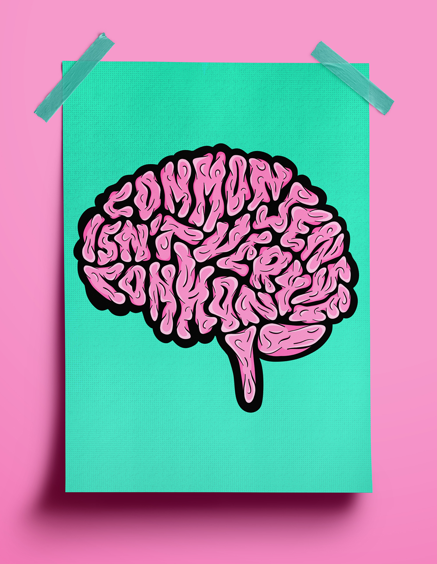
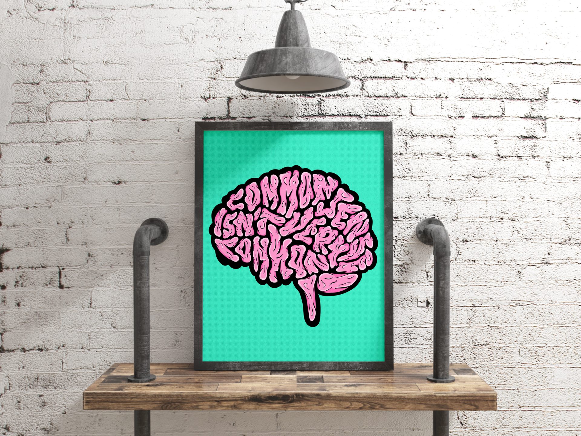
This artwork is a bold and playful lettering piece that pokes fun at the idea that “Common sense isn’t very common.” The letters twist and turn like a brain’s folds, blending into each other in a chaotic but clever way that gets the point across. The mix of pink tones with bold black outlines adds some solid contrast and depth, making the design pop off the turquoise background. It’s a cheeky visual that makes you stop and think, maybe common sense isn’t so common after all.

